Good web UI is not graphic design applied to a screen. It is its own discipline.
There is a category of UI design advice that sounds correct but fails on the web: principles developed for print, borrowed by desktop software, and applied to websites with the assumption that screens are just digital paper. They are not. A web page is a live environment. It responds to input. It exists at different sizes simultaneously. It loads progressively, competes for attention against a hundred other tabs, and is experienced on devices ranging from a 27-inch monitor to a 390-pixel phone screen held one-handed on a train.
The UI principles that hold up on the web are the ones built around those specific conditions. Here is what they are, why they work, and how they translate into practice.
01. Design for the user's mental model, not the product's structure
The most persistent UI failure on enterprise websites is navigation that mirrors the organisation's internal structure rather than the user's mental model of what they need. Services grouped by business unit. Content organised by department. Navigation labels that make sense inside the company and mean nothing to someone arriving from a search.
Users arrive at a website with a question. The UI's first job is to answer it - or to make the path to the answer immediately visible. This means building personas around specific user goals, mapping the questions those personas are arriving with, and designing navigation and information architecture around those questions rather than around the org chart.
In practice this affects everything from the top-level navigation labels - Services not Solutions; Work not Portfolio - to the order of content on a service page. The user's question comes first. The organisation's preferred framing comes second.
02. Hierarchy communicates before content does
On the web, a user scans before they read. Eye-tracking research has consistently shown that users form a spatial impression of a page in the first few hundred milliseconds - identifying what is prominent, what is secondary, and what can be ignored - before they have read a single word. Visual hierarchy is the mechanism that makes that scan useful rather than confusing.
Effective web hierarchy means type size and weight that clearly differentiate heading levels. Spacing that groups related elements and separates distinct sections. Colour and contrast used to create emphasis, not decoration. And a consistent scale - applied uniformly across the site - so the hierarchy reads the same on every page without the user having to relearn it.
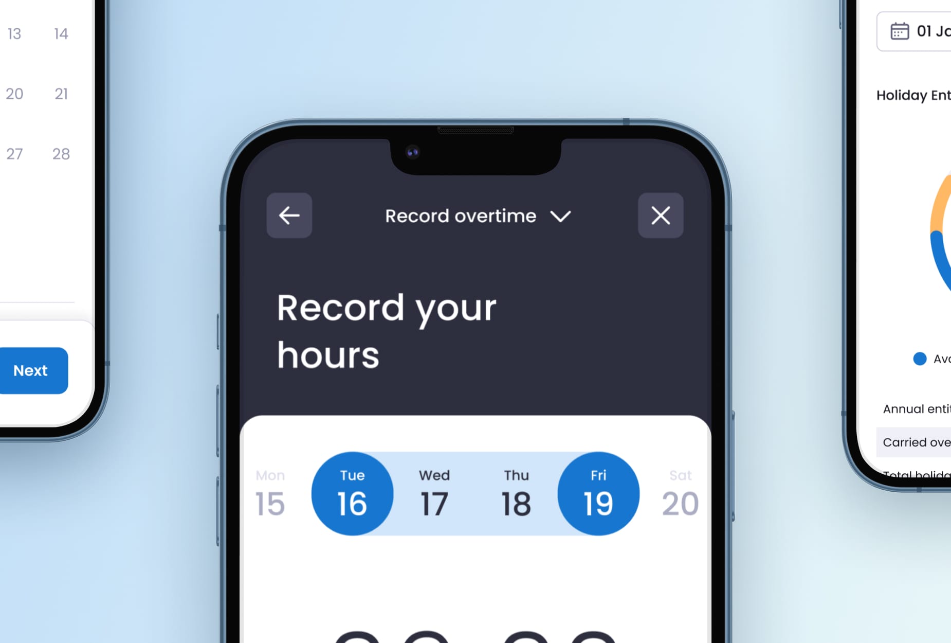
The web-specific challenge is that hierarchy must work across a wide range of viewport sizes. An H1 that reads as dominant at 1400px may look disproportionately large at 390px. Webflow's typographic scale controls allow teams to define separate type scales at each breakpoint, so hierarchy is designed for each context rather than scaled down from a single desktop decision.
03. Interactive elements must look interactive
This principle sounds obvious and is violated constantly. Buttons that look like static text. Links with no visual differentiation from surrounding copy. Form fields that are indistinguishable from plain text until clicked. Each of these is a friction point - a moment where the user has to work out whether an element is interactive rather than immediately knowing.
The web has established conventions for interactive elements that users have internalised over decades: underlined or distinctly coloured hyperlinks, bordered or backgrounded buttons, labelled input fields. Departing from these conventions in the name of visual minimalism introduces cognitive overhead that reduces conversion and damages trust. The interface should not require the user to investigate it.
Hover and focus states are the web-specific layer on top of this principle. An element that changes visibly on hover confirms interactivity before the click. A focus state that is visible on keyboard navigation makes the interface accessible - and is now a legal requirement under WCAG 2.1 AA in many markets. Webflow's interaction system makes both straightforward to implement without custom CSS for every element.
04. Error prevention beats error recovery
The most underinvested area of web UI is error states - specifically, the design thinking that should happen before an error occurs rather than after it. Users make predictable mistakes on the web: they submit forms with missing required fields, they enter data in the wrong format, they navigate to pages that have moved. Each of these is a friction event that interrupts momentum and increases the probability of abandonment.
Error prevention means: form validation that catches problems before submission rather than after, inline guidance that tells users what format is expected before they get it wrong, confirmation steps for irreversible actions, and 301 redirects that route users who arrive at moved pages to the right destination rather than a 404.
Error recovery - the state the user sees after something has gone wrong - should be equally deliberate. An error message that explains what happened and what to do next is a fundamentally different experience from a generic failure state. On form submissions in particular, the error message is often the moment that determines whether a high-intent visitor converts or abandons.
05. Consistency compounds trust
Consistency in web UI is not about visual monotony - it is about building a pattern language that users learn once and can apply across the entire site. A button that looks the same and behaves the same everywhere trains the user to act without hesitation. A card component with a consistent structure across a portfolio, a blog, and a case study section lets users transfer their understanding from one context to another.
Inconsistency - different button styles on different pages, navigation that changes structure between sections, type scales that vary without clear reason - creates friction and signals a lack of craft. For enterprise organisations where the website is a primary trust-building tool, inconsistency is a credibility problem as much as a design problem.
This is where design systems and component libraries become operationally important rather than theoretically desirable. Webflow's Shared Libraries allow enterprise teams to maintain a component system centrally and deploy it across every site in their portfolio. A design decision made once propagates everywhere. A change to a button style updates across hundreds of pages simultaneously. Consistency becomes a structural property of the build rather than a discipline that requires manual enforcement on every new page.
06. Data should drive iteration, not instinct
UI decisions are hypotheses. The hypothesis that a particular CTA placement will convert better than an alternative, that a specific colour contrast will improve engagement, that a revised form layout will reduce abandonment - each of these is testable, and testing them is the only way to know if the hypothesis was correct.
The tools for web-specific UI testing are well established. Session recording and heatmaps (Hotjar, Microsoft Clarity) reveal where users engage and where they stop. A/B testing compares specific variants against measurable outcomes. Analytics show the aggregate patterns that individual session recordings cannot.
What has changed is the velocity at which enterprise teams can run these tests. Webflow Optimize allows marketing teams to create UI variants and run A/B tests without developer involvement - the same visual environment used to build the site is used to build the variant. For enterprise teams where UI improvements have historically required a development ticket, a QA cycle, and a deployment window, this is a meaningful change in how quickly good design judgement can be validated and applied.
N4's design practice is built on all of these principles - applied from the first wireframe through to post-launch optimisation. If you want to see what that looks like in practice, our work is the place to start. If you want to build it for your organisation, let's talk.