Wispr Flow
A site launch to match a category-defining product

Wispr Flow's voice AI already runs behind the scenes for engineers at companies like Nvidia and Amazon, with public advocates like Steven Bartlett, Reid Hoffman, and Tim Ferriss. Then came Notetaker, Wispr's biggest swing since Flow itself, and it launched straight into a meeting-notes market already stacked with competitors.
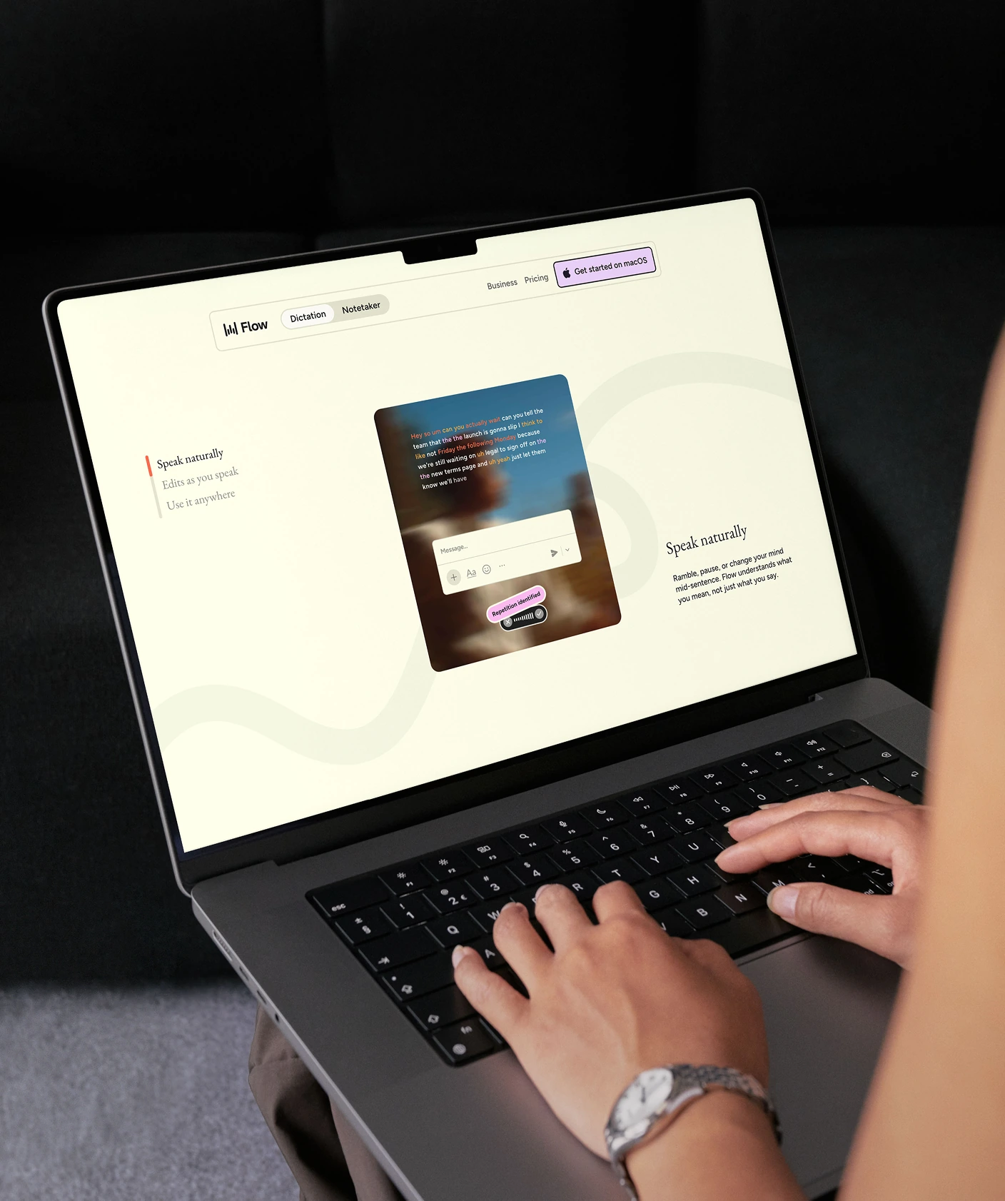
The brief was ambitious, and Wispr's CMO, Daniel McCallum, set the bar. A brand new product launch needed a homepage and pricing built to match that ambition. We shaped the approach around the same native instinct; if Wispr turns rambling speech into something refined and considered, the site needs to do the same with a scroll.
SERVICES
Awards
↑25%
Faster page load

$2B
Company valuation
100 Billion
Words transcribed
100/100
Accessibility Score
Testimonials
Challenge
Perfection wasn't optional in a market this loud
The AI meeting-notes market was already crowded. Granola, Fireflies, and Otter were all chasing the same few minutes in every calendar. Notetaker stood out by skipping the bot that other tools drop into your call, and by using the intelligence and context Wispr already had. That edge needed a site sharp enough to make it land, with nothing about the build allowed to feel average.

Solution
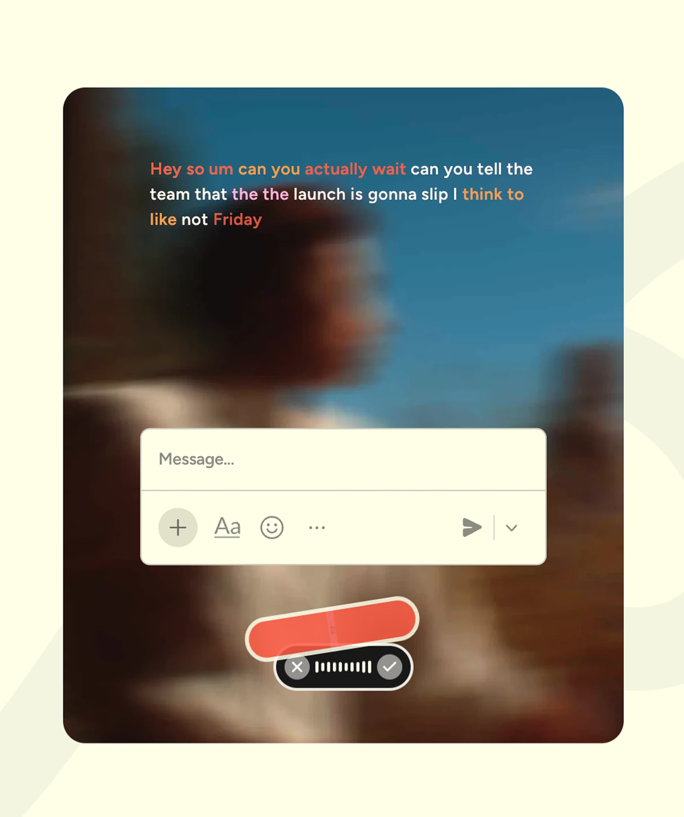
Chaos into order, on every page
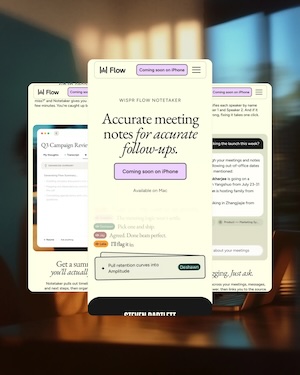
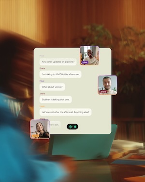
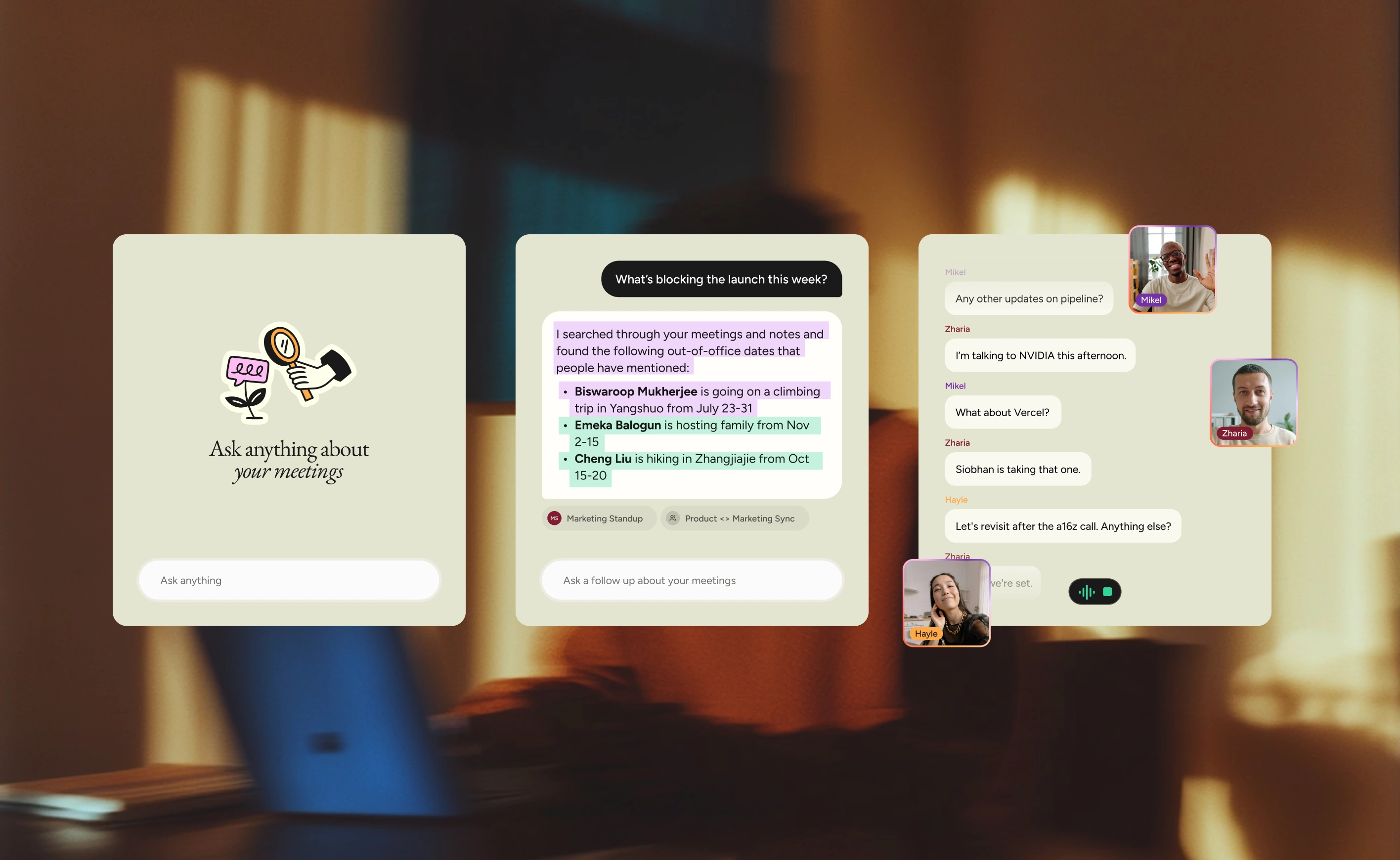
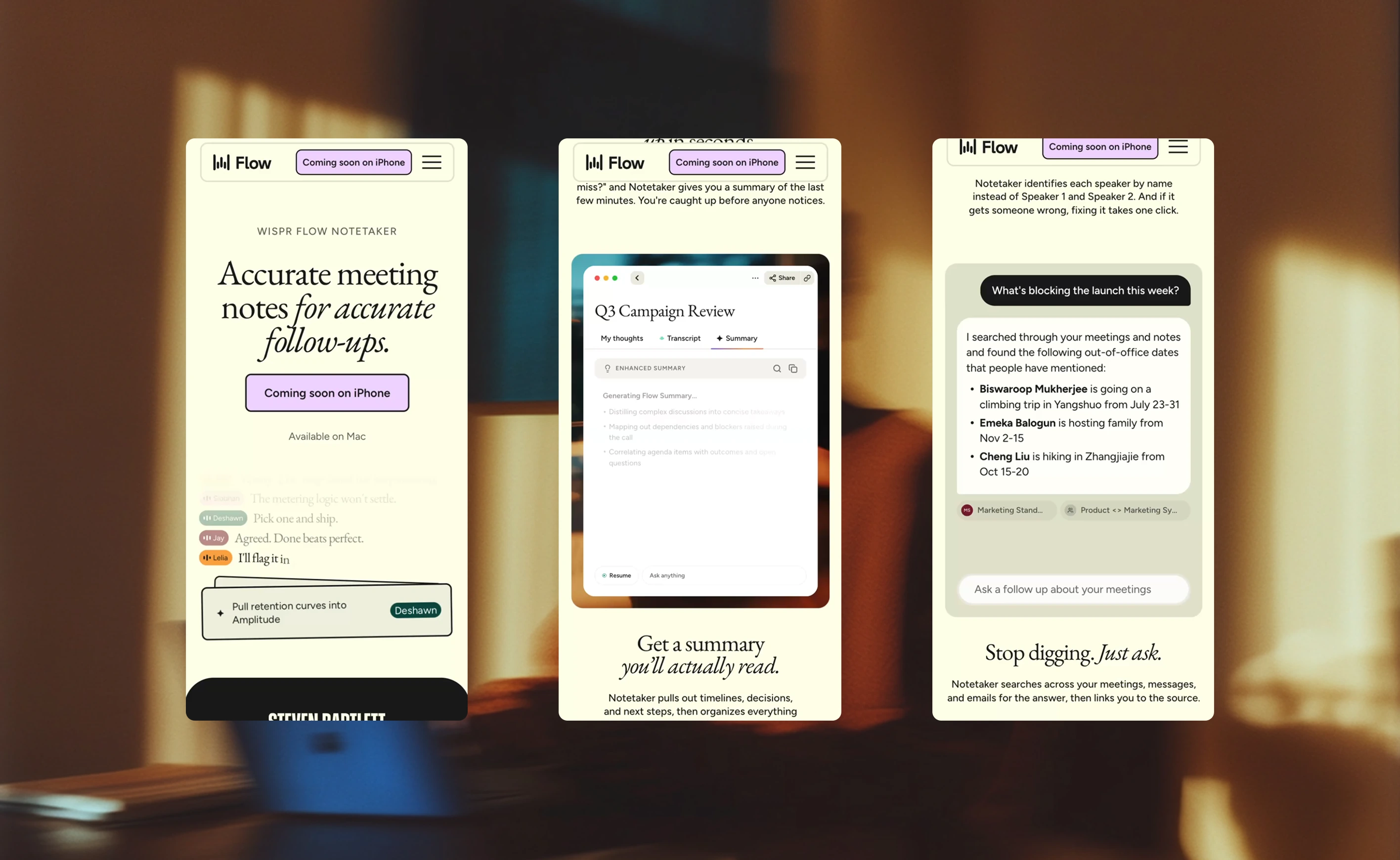
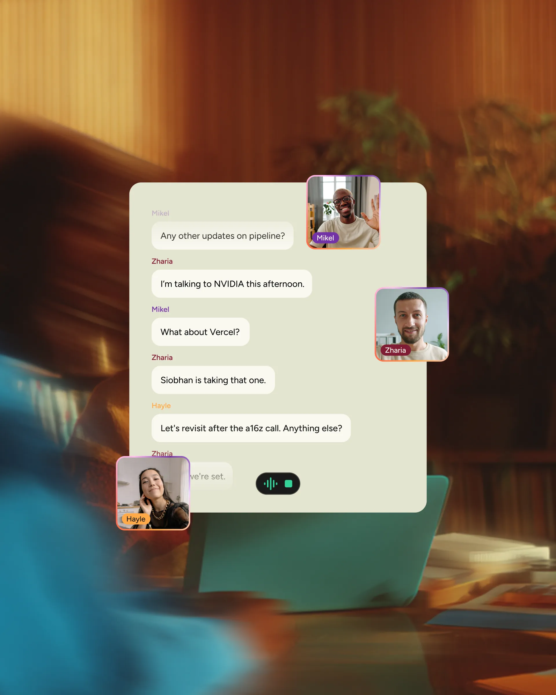
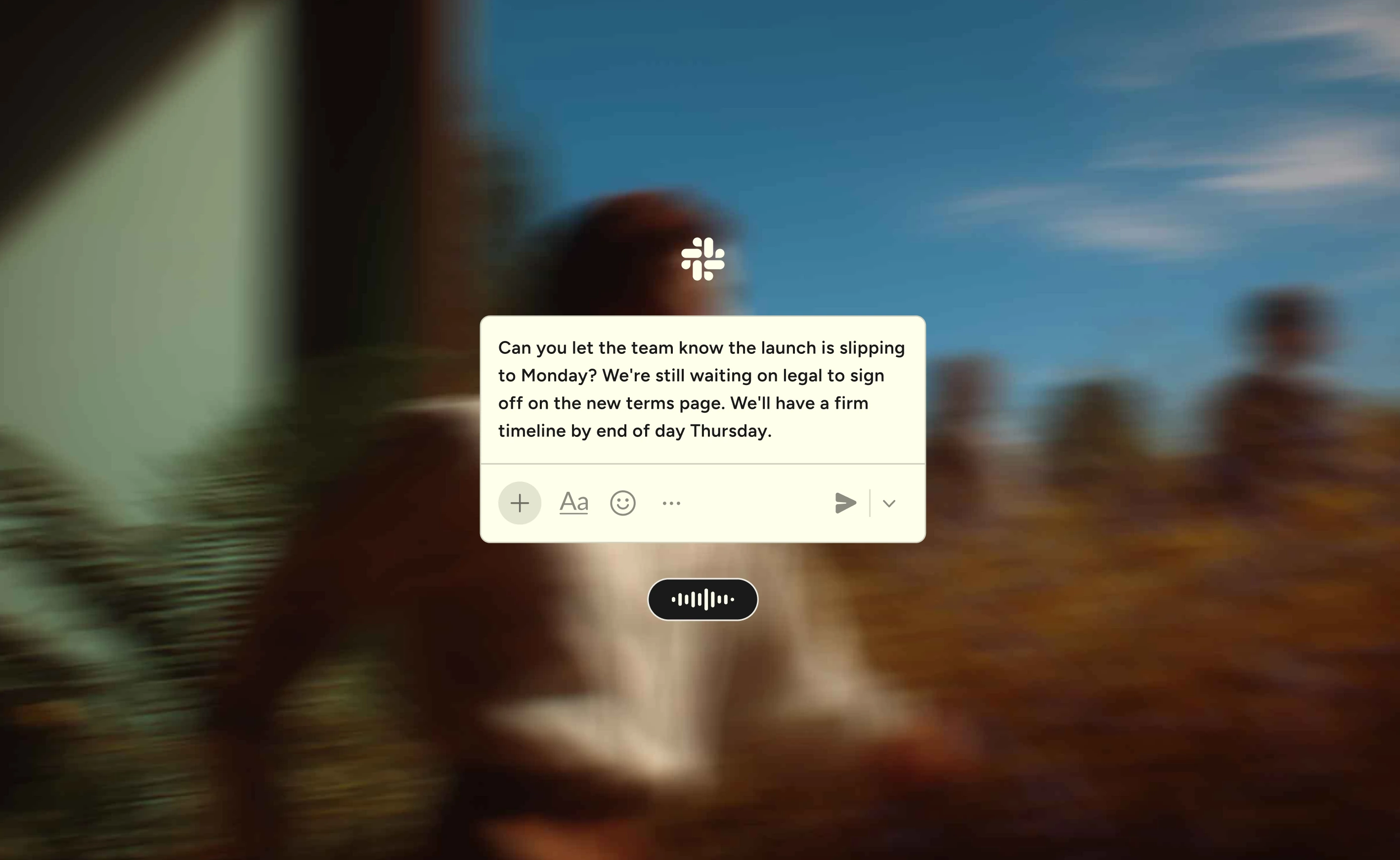
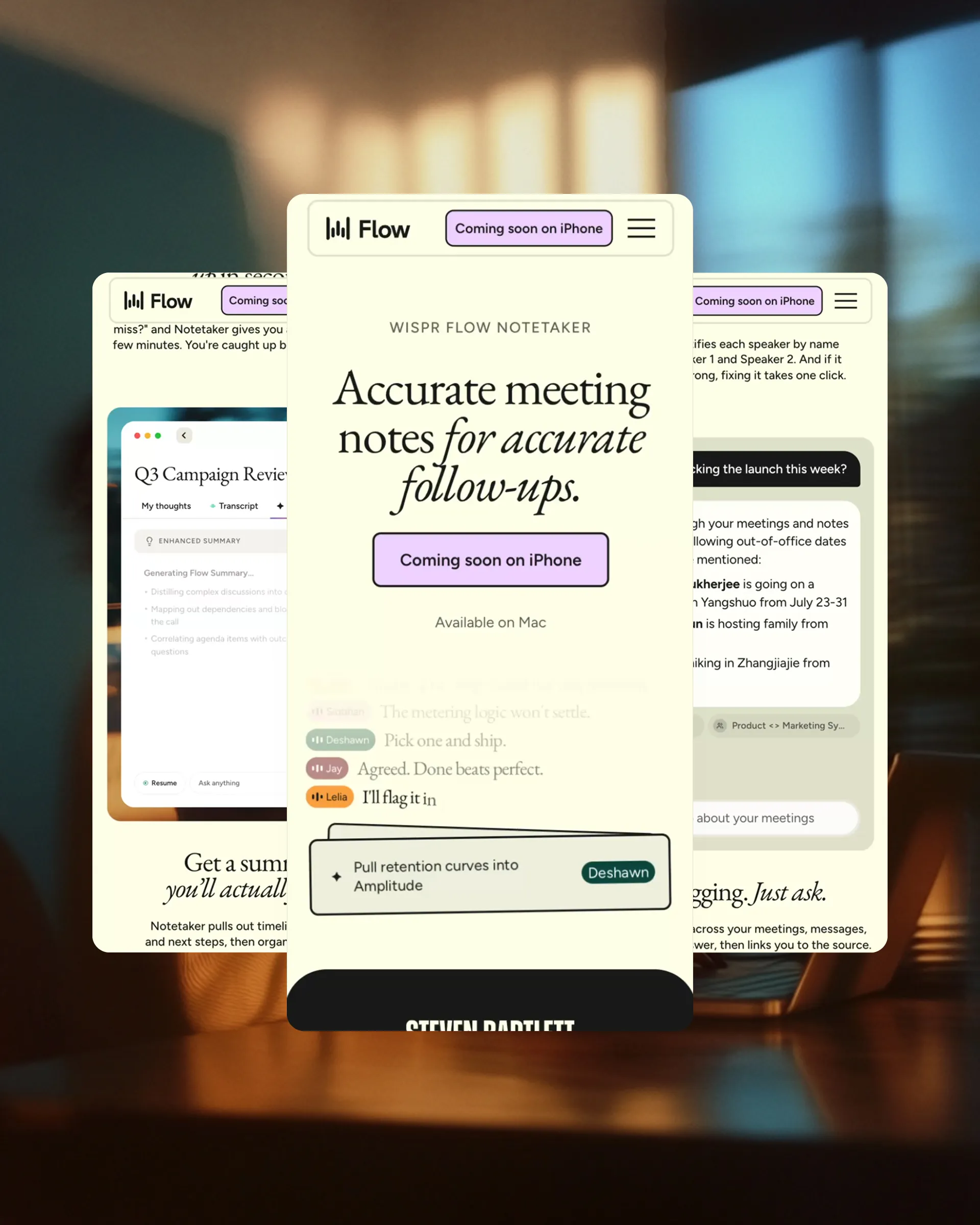
The Notetaker page centers on a scroll-triggered animation that shows the product turning scattered meeting chatter into a clean set of actions, the motion proving the tool's point before anyone reads a word of copy. The "what did I miss" summary card and the "ask anything" interaction got the same craft, animated so each one acts out its own behavior in real time.
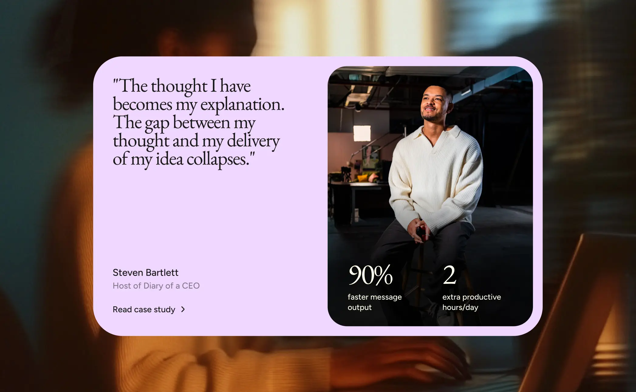
That same level of consideration carried through the rest of the site. The testimonials section runs on a custom scroll, surfacing one voice at a time as someone reads down the page. The homepage, pricing, and navigation followed the same intent, giving Flow and Notetaker equal footing on one connected site.
Mobile performance came first, always
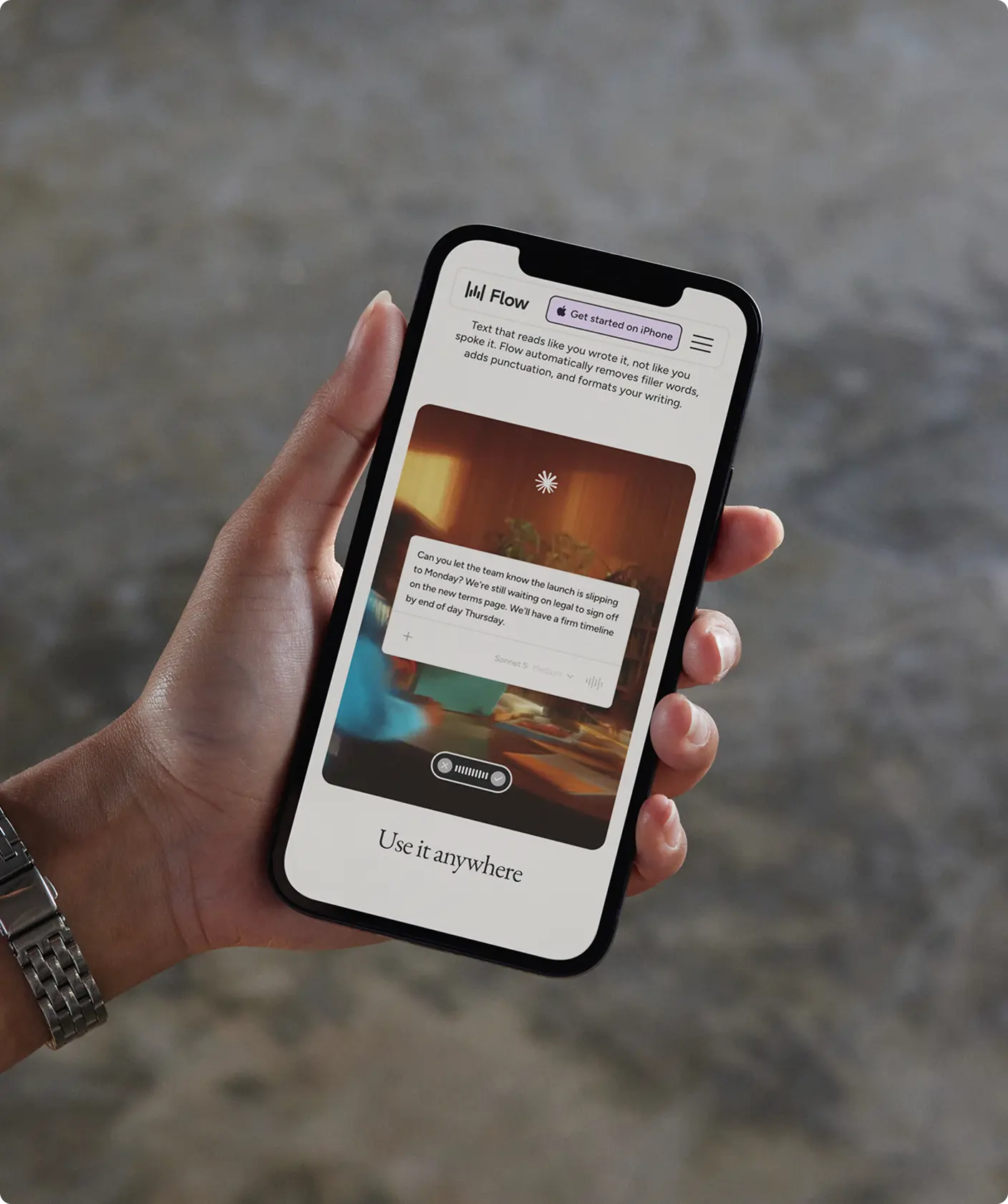
The redesign runs mobile first, tested past launch to catch anything a design file couldn't predict. When one section's animation faltered on Safari, the fix shipped fast, holding the same line as the rest of the build. The standard held from the homepage down to the smallest screen.
More Projects


Business Insider
Business journalism doesn’t have to be boring




McCabe World Travel
Crafted for the world’s most demanding travellers