Memorable is not an aesthetic quality. It is a strategic one.
A memorable website is one that does something to the person experiencing it. It makes them feel something about your brand, understand something about your offering, or trust something about your organisation that they did not feel, understand, or trust before they arrived. That response - which converts into recall, return visits, referrals, and ultimately revenue - is the result of deliberate strategic and creative decisions, not just visual polish.
For enterprise organisations where the website is the primary brand asset and a critical commercial channel, the question is not whether to invest in a memorable web experience. It is what the most valuable investments actually are.
01. Design a consistent, controlled brand environment
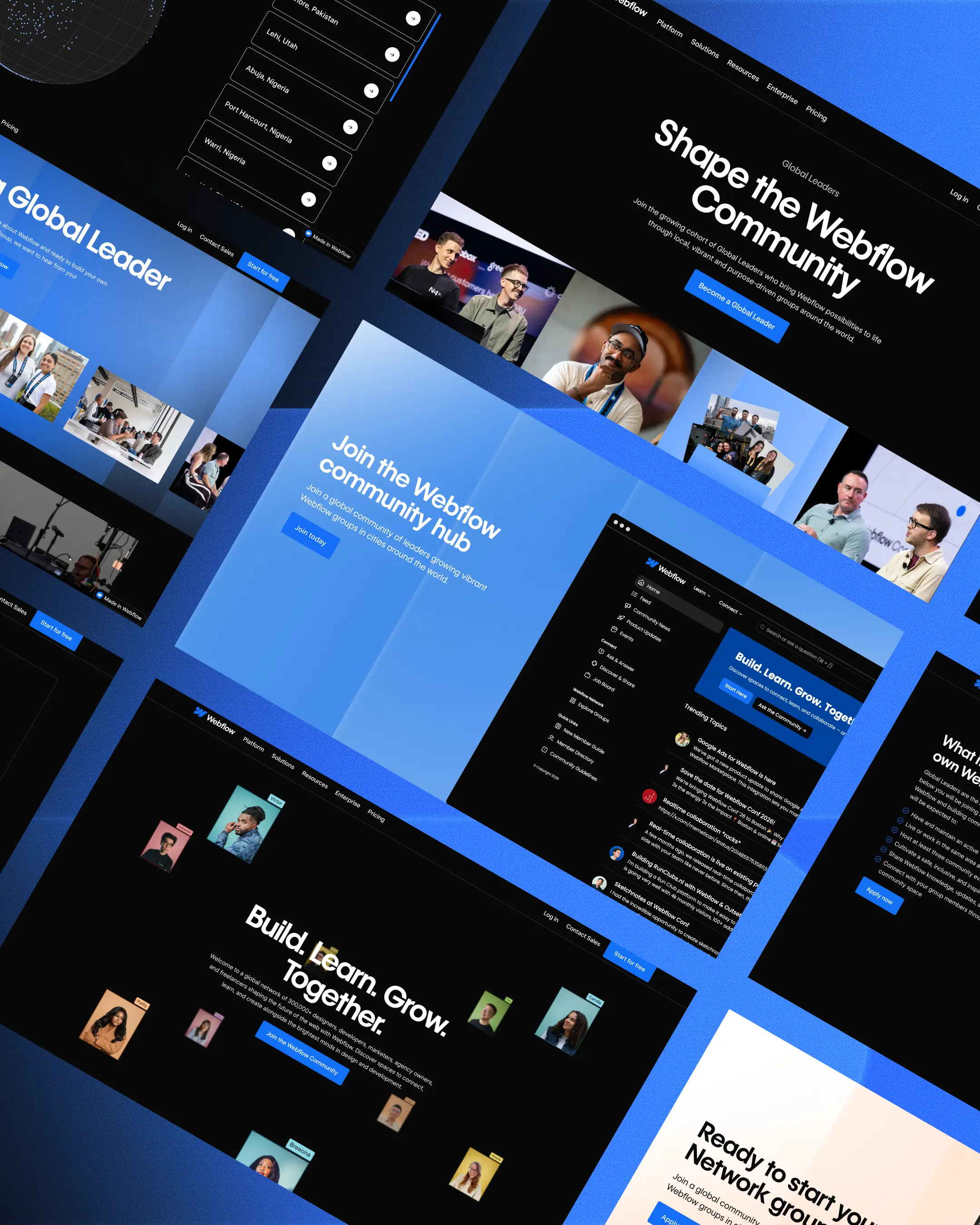
The most immediate way a website becomes memorable is through a visual and tonal identity that is completely and distinctly its own. Not borrowed from a template. Not assembled from a theme with brand colours applied. An environment where every typographic choice, every spacing decision, every motion behaviour communicates something specific about who you are.
This requires a design system - a structured set of components, tokens, and usage rules that ensure every page, every new section, and every future update stays coherent with the established identity. Without a design system, brand consistency degrades over time as teams make individual decisions. With one, the brand compounds: every new piece of content reinforces the identity rather than diluting it.
Webflow's Shared Libraries allow enterprise teams to maintain a design system centrally and deploy it across every site in their portfolio. Changes to core components cascade automatically. New pages inherit the right typography, spacing, and interactive behaviour without manual enforcement at the page level. This is the infrastructure that makes brand consistency operationally sustainable at scale.
02. Build for flow, not just pages
A memorable website is not a collection of individual pages - it is a journey. The experience of moving from the homepage into a service section, from a service section into a relevant case study, from a case study into a contact flow should feel continuous and considered. Each transition should maintain momentum and advance the visitor's understanding and intent.
Achieving this requires thinking about the user journey before designing individual pages. What are the most common paths visitors take? Where do they drop off? What does a visitor who has arrived from an AI-generated answer need at that specific moment compared to one arriving from a direct search for your brand name?
The answers shape navigation structure, internal linking, CTA placement, and the sequencing of information on each page. Flow is the structural quality that keeps visitors engaged. Visual design is what makes the structure feel effortless.
03. Use motion and interaction purposefully
Animation is one of the most powerful differentiators available to enterprise web teams - and one of the most frequently misused. Applied well, motion communicates brand character, guides attention, confirms interaction, and creates the kind of immersive quality that makes a site feel alive rather than static. Applied poorly, it slows page load, distracts from content, and signals creative self-indulgence over user consideration.
The discipline is intentionality. Every animation should answer a specific question: what does this motion communicate that static design cannot? If the answer is not clear, the motion is probably not necessary.
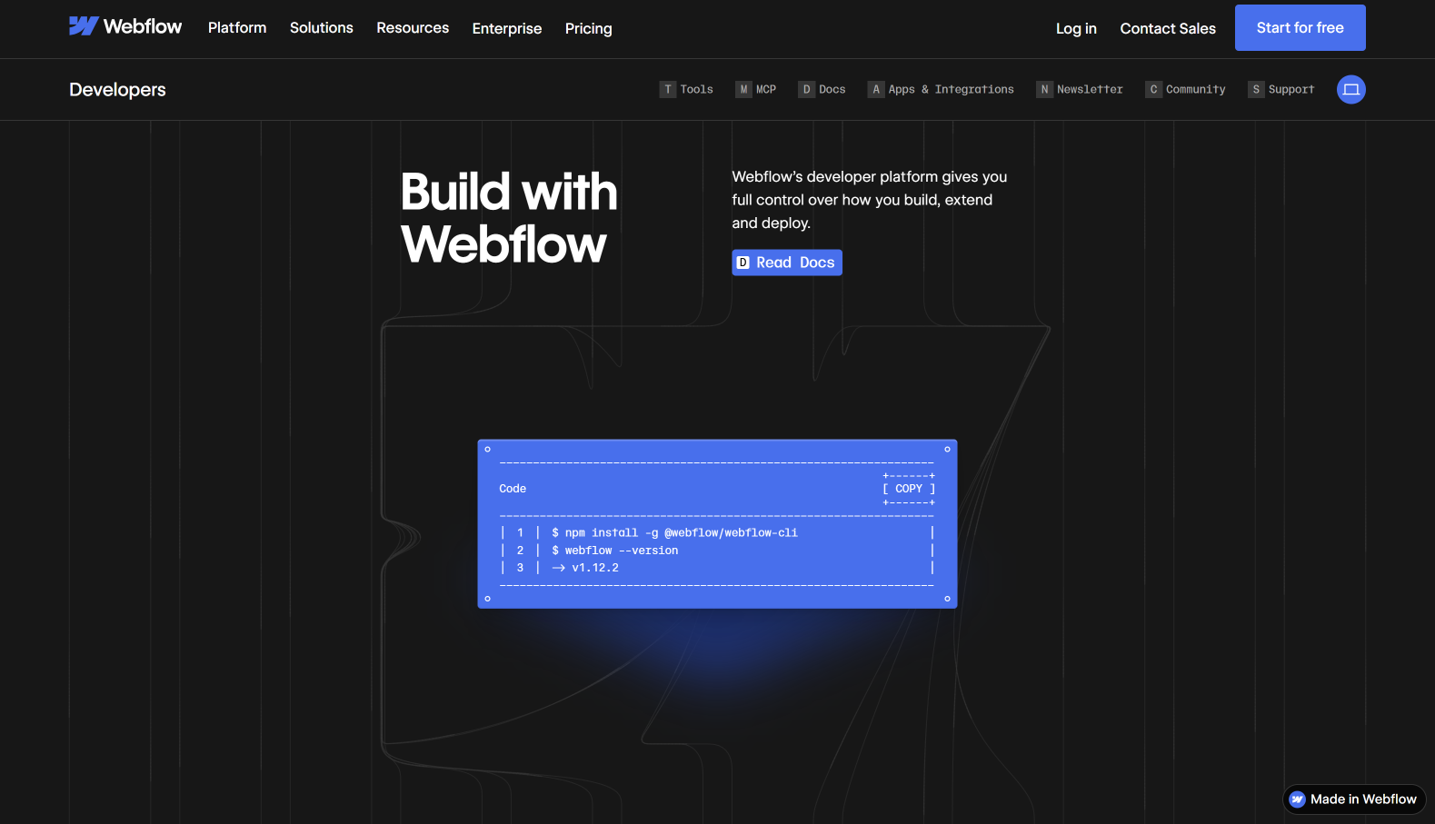
Webflow's Interactions and Animations system - and its native integration with GSAP, one of the most sophisticated JavaScript animation libraries available - gives enterprise teams the ability to build complex, high-quality motion without custom JavaScript for every effect. Scroll-triggered sequences, hover states, page transitions, and parametric interactions are all built visually, which means the team creating the design is also controlling the motion. The result is creative work that stays coherent across the entire experience.
04. Make contact frictionless at every stage
The moment a visitor decides to take action is the most important moment in the entire web experience. If it is followed by a form with twelve required fields, a navigation maze to find the right contact, or a generic "we'll be in touch" confirmation, the momentum of that decision evaporates.
Frictionless contact means: the path to conversion is visible from every significant page; the ask is proportionate to the stage of the journey (a newsletter signup early, a discovery call request later); the form is short enough to complete in under a minute; and the confirmation is specific enough to feel human.
For enterprise sites with multiple audience types and buyer stages, this often means multiple conversion paths - not a single contact form. Webflow Optimize allows teams to test different conversion architectures, CTA placements, and form designs against real traffic, so the best-performing approach is identified through evidence rather than opinion.
05. Optimise for performance - it is part of the experience
A website that loads slowly is not a memorable experience. It is an abandoned one. Core Web Vitals - LCP, INP, and CLS - are not just ranking signals. They are the measurable expression of how a visitor experiences the first seconds on your site. Poor scores mean visitors see layouts shift, interactions feel sluggish, and content arrives late. Those micro-failures accumulate into an impression of a brand that does not take quality seriously.
Webflow's clean HTML output, global CDN, and automatic image optimisation give enterprise sites a performance baseline that most theme-based or plugin-heavy CMS platforms cannot match without significant engineering effort. The memorability of a Webflow-built site is partly a result of what visitors feel - fast, stable, responsive - before they have consciously evaluated anything about the design.
06. Mobile is not a version. It is the primary experience.
The majority of first encounters with enterprise brands now happen on mobile. The implication is that the mobile experience is not a simplified version of the desktop site - it is the canonical experience for a large portion of the audience, and it should be designed with that weight.
Webflow's breakpoint system allows teams to design each viewport independently. The mobile experience can have different typography scales, different content prioritisation, different interaction patterns, and different CTA prominence than desktop - without maintaining separate codebases. This is the standard that enterprise web experience now requires, and it is achievable without the development overhead that separate mobile implementations have historically demanded.
If you want to understand what a memorable, high-performing enterprise web experience looks like in practice, our work is the clearest demonstration. If you want to build one, let's talk.

.jpeg)
.jpeg)
.jpeg)