The brief came in as a Slack message: grid lines bending around the W, like air or water flowing past it. Specific enough to be exciting, loose enough that I read it as a feel rather than a spec. So I started experimenting with approaches that captured that quality, fluid, organic, a little unpredictable.
Then the proper brief landed. The lines weren't just supposed to evoke a grid, they had to sit on Webflow's actual 12-column grid. That changed everything.I kept pushing the same approaches with the new constraints in mind, but the tension became obvious pretty quickly. Everything I had built was optimized for organic behavior, and organic behavior is exactly what you don't want when pixel-perfect column alignment is the focal point. The W outline suffered for the same reason. I scrapped it all and started over.
Let me walk you through what I tried, why it didn't work, and what finally did.
The constraints
Three things had to be true, and two of them pull against each other.
The W has to hold its shape. The straight parts of the lines have to sit exactly on Webflow's real 12-column grid, not approximately. And it has to be light enough that nobody notices it in the performance tab.
The tension is between the first two. A line that bends nicely around a letter is easy. A line that bends and also lands back on a precise column edge is harder. Most of the techniques I reached for were good at one and bad at the other.
What didn't work
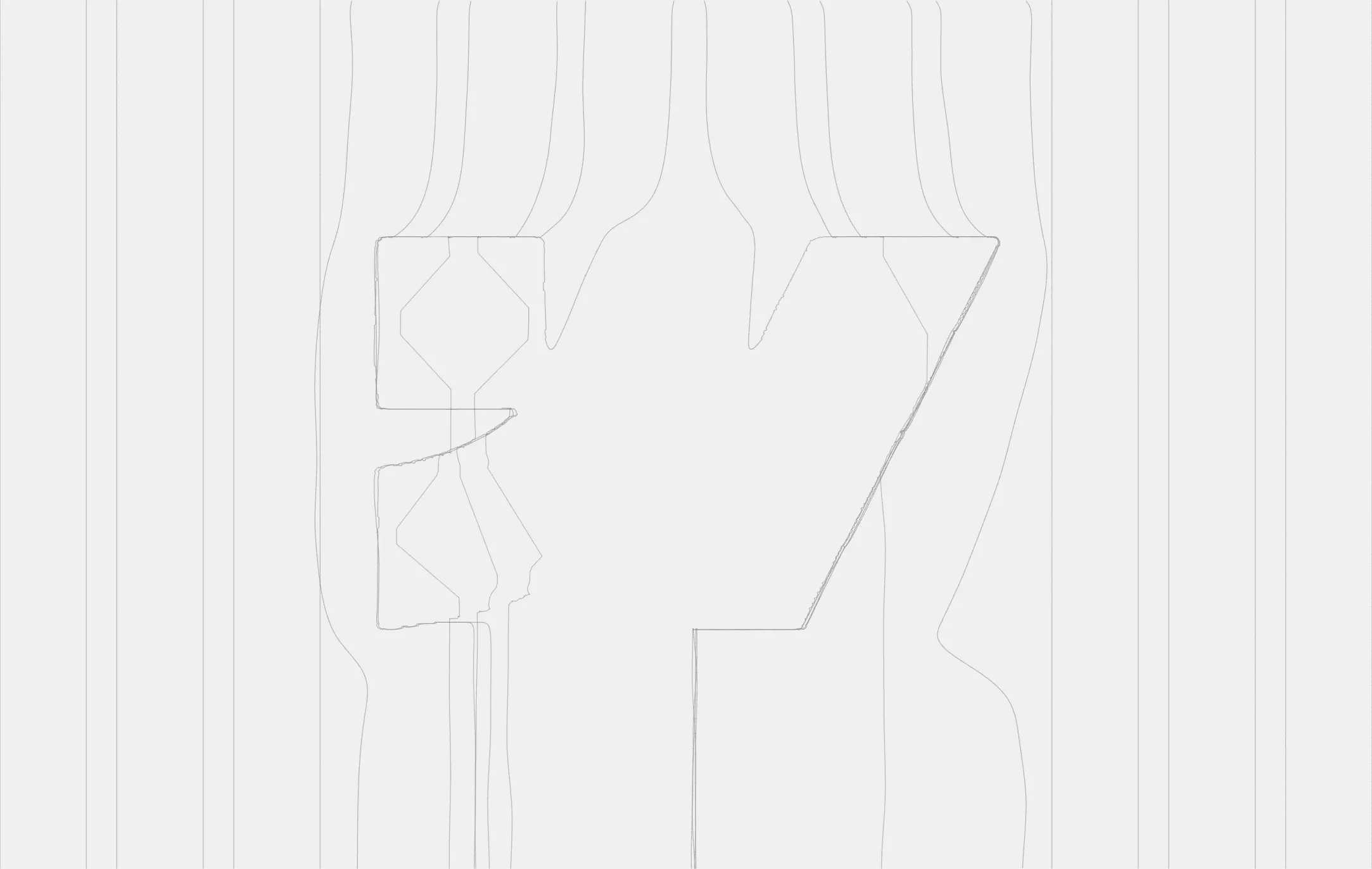
The first instinct was the most obvious one: warp the lines around the SVG shape directly. Simple distortion, lines bending away from the W outline. It read okay but never felt precise. The notches and angles of the W got softened, and the lines didn't know which way to go near the inner strokes.
So I moved toward physics. A pull field, lines attracted or repelled by the nearest edge of the W. The idea was sound but the force was never strong enough to be convincing, and when it was strong enough the lines went in the wrong direction entirely.
Next came flow-based approaches, first a water-style potential flow solver, then a hybrid mixing flow and velocity. The math was correct and the results looked more natural, but the same problem kept appearing: smooth physics rounds off sharp corners. The V-shaped notches in the W got smoothed away, and I kept losing the logo.
The most promising dead end was an aerodynamic approach, contour lines of a proper fluid flow field, the kind of math used to model wind around an obstacle. Those contours physically cannot pierce the W, which solved the interior problem. But it made every line on the page react to the shape, not just the ones near it, and the notches still got eaten.
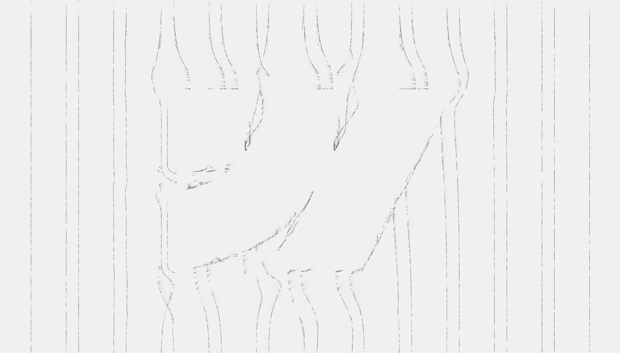
The last attempt before the pivot was particle fields, the kind you've seen in anvaka's fieldplay: thousands of particles drifting along a velocity field. They fall down the field, slide along the surface of the W, and never enter the shape. It moved beautifully. But the lines nearest the center kept diving into the inner strokes of the W instead of clearing them, and particles sometimes ended up sitting on the letter. Close, never clean.
All of these shared the same root problem. The more physically accurate the simulation, the more organic and unpredictable the output. That's the wrong quality when your focal point is a pixel-perfect grid. Many experiments in, the answer turned out to be the simplest one.
%201.webp)
The fix
Stop simulating flow. Draw what the designer actually drew.
The hero design already existed. I exported the exact lines from Figma as an SVG: 24 paths in total, 12 straight grid lanes and 12 curved paths around the W. I embed those paths, sample each one into a polyline, and draw them on a plain canvas.
const len = path.getTotalLength();
const n = Math.max(2, Math.round(len / 4)); // ~4px per sample
for (let i = 0; i <= n; i++) {
  const p = path.getPointAtLength((i / n) * len);
  pts.push([p.x, p.y]);
}
That removed the entire fight over the center lines. They behave because someone drew them behaving.
Stack: Vanilla JavaScript and Canvas 2D. No WebGL, no flow solver, no dependencies. After three increasingly complex prototypes, the version that shipped is the plainest one.
Making fixed paths live on a responsive grid
The real work was making static SVG paths adapt to a live, responsive layout.
Lane anchoring. Each line is pinned to its own column. Its bend is stored as a scaled offset from that column, so the straight parts always land on the real grid while the curves stay smooth.
const dev = sx - laneX_design;         // how far this point sits from its own lane
const xLane = laneX_live + dev * scale; // re-anchor that offset onto the live grid
Convergence. Two lines curving around the same side of the W would otherwise sit slightly apart and make the edge look doubled and blurry. As they bend, each pair converges toward a shared path, so they read as one crisp edge. Straight sections stay on their own lane.
const w = Math.min(1, Math.abs(dev) / CONVERGE); // 0 on the lane, 1 deep in the bend
x = xLane * (1 - w) + xShared * w;
Paint-on by length. On load the lines draw themselves at a constant speed, so the longer paths that loop around the W take longer to finish. It reveals the shape in a natural way.
const revealLen = (VH / introFrames) * t; // grows every frame
// draw only the part of each path whose accumulated length is below revealLen
The problems you don't see live
The concept was the quick part. Getting it pixel-accurate inside Webflow across browsers took longer than everything before it.
Matching the grid. Computing the grid from guessed values, max-width, gutters, column count, doesn't work: it drifts at each breakpoint, and the error grows outward from the center. So I measure the live page instead. I inject a hidden copy of Webflow's own .section > .container markup, read the resolved container width and gutter from the rendered DOM, and compute the 12 lanes from that.
probe.style.width = 'var(--_components---container--gutter)';
const gap = parseFloat(getComputedStyle(probe).width); // resolved to px
The scrollbar. The hero looked right in the responsive window but sat about 20px off in a real fullscreen browser. The cause: window.innerWidth includes the scrollbar, and the grid is measured without it. The responsive window uses a zero-width overlay scrollbar, so the bug was invisible exactly where I was checking.
VW = document.documentElement.clientWidth; // not window.innerWidthCold load. On a fresh load the W sometimes sat too high and corrected only after a manual resize. The first measurement runs before fonts and images load and the page reflows. So now I re-measure on `load`, on `fonts.ready`, through a `ResizeObserver`, and with a couple of delayed checks.
Keeping it light
Because it's a canvas, the performance work was simple.
The engine can stop drawing entirely when nothing is moving, holding the last frame at near-zero CPU. In production the comets run continuously, so it does keep painting, but it's cheap: thin lines on a 2D canvas. Visitors with `prefers-reduced-motion` set get the full grid drawn once, statically, with no intro and no comets. The line and background colors are read from Webflow's own theme variables, so the hero follows light and dark mode with no extra code.
The comets came out of that first particle experiment. The team liked the motion enough to keep it, so it made the cut: little trails that run down the curves on a staggered, rain-like timing, always on unless a visitor prefers reduced motion.
What I'd take to the next one
The lesson: the cleanest solution is usually the least clever one. I had a flow solver and a particle engine running before I accepted that the right move was to render the designer's exact lines and put the effort into making them sit perfectly on a live grid. The hard problems weren't the math, they were a scrollbar, a load-timing race, and a mis-named CSS variable.
See it live here: https://developers.webflow.com/

.jpeg)
.jpeg)

.jpeg)