APR
Positioning, identity, and a site to carry
Brands like Google, Diageo, Subway and Jeep rely on APR to check whether their production spend stacks up, line by line. When an agency says a campaign cost what it cost, APR is the firm that reads the invoice and decides whether that’s true. Judging what creative work is worth is the whole job.
Twenty-five years in, APR had rebuilt its offer around AI and data, and its brand hadn’t kept pace with its reputation. There was nothing worth refreshing, only a standing worth living up to, and a buyer who would notice if the firm that scrutinises everyone else’s work turned up looking like an afterthought.
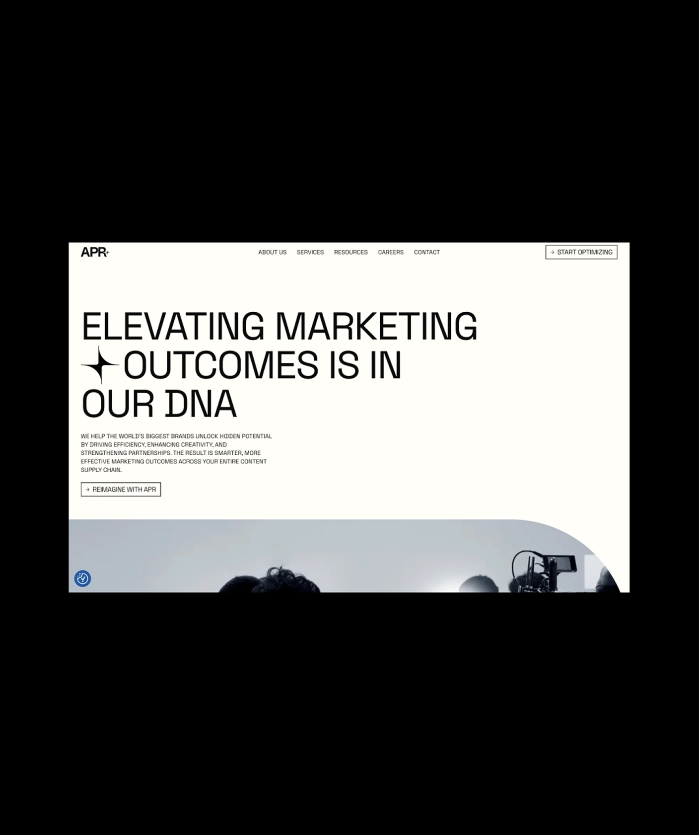
N4 built the brand from the ground up: positioning and messaging, a new identity and voice, the system that carries them across proposals and decks, and the website that puts it all in front of a CMO. The firm that reviews agency work for a living trusted us with its own, from first principles to launch.
SERVICES
↑290%
Impressions (YoY)

↑320%
Organic traffic (YoY)
↑75%
Average position
100/100
Accessibility score
Testimonials
Challenge
Old authority, new story
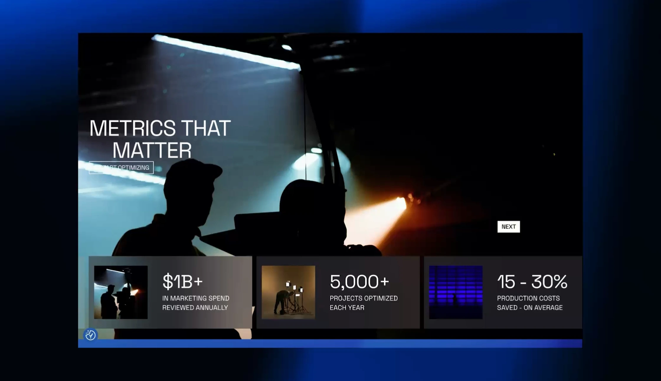
APR sells to CMOs and marketing operations leads, people who answer for every dollar of production spend and stay skeptical of consultants until they see proof. Up against firms like Accenture, APR needed to look like the specialist it is: easy to grasp, confident up front, and with a proper stage for the thinking that wins its work.
Solution
A North Star for the people brands steer by
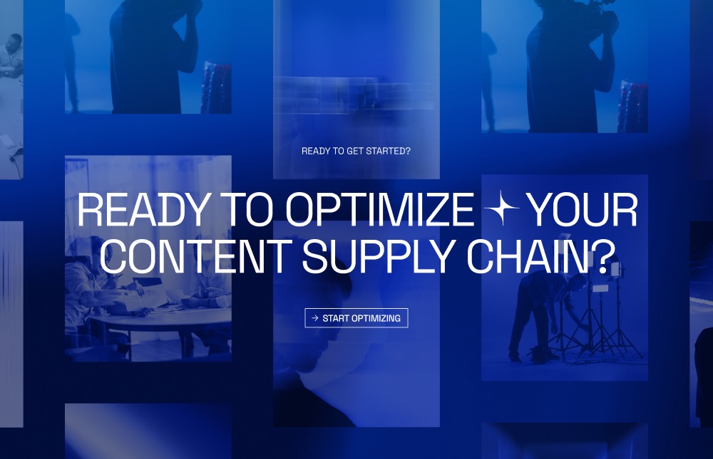
We started with the positioning. We mapped APR’s buyers and the consultancies it competes with, and used that to define what APR stands for and how it should sound. “Spend wiser. Create smarter. Partner better.” came out of that work, and it shaped everything after: the sitemap, the content architecture, and the copy on every page.
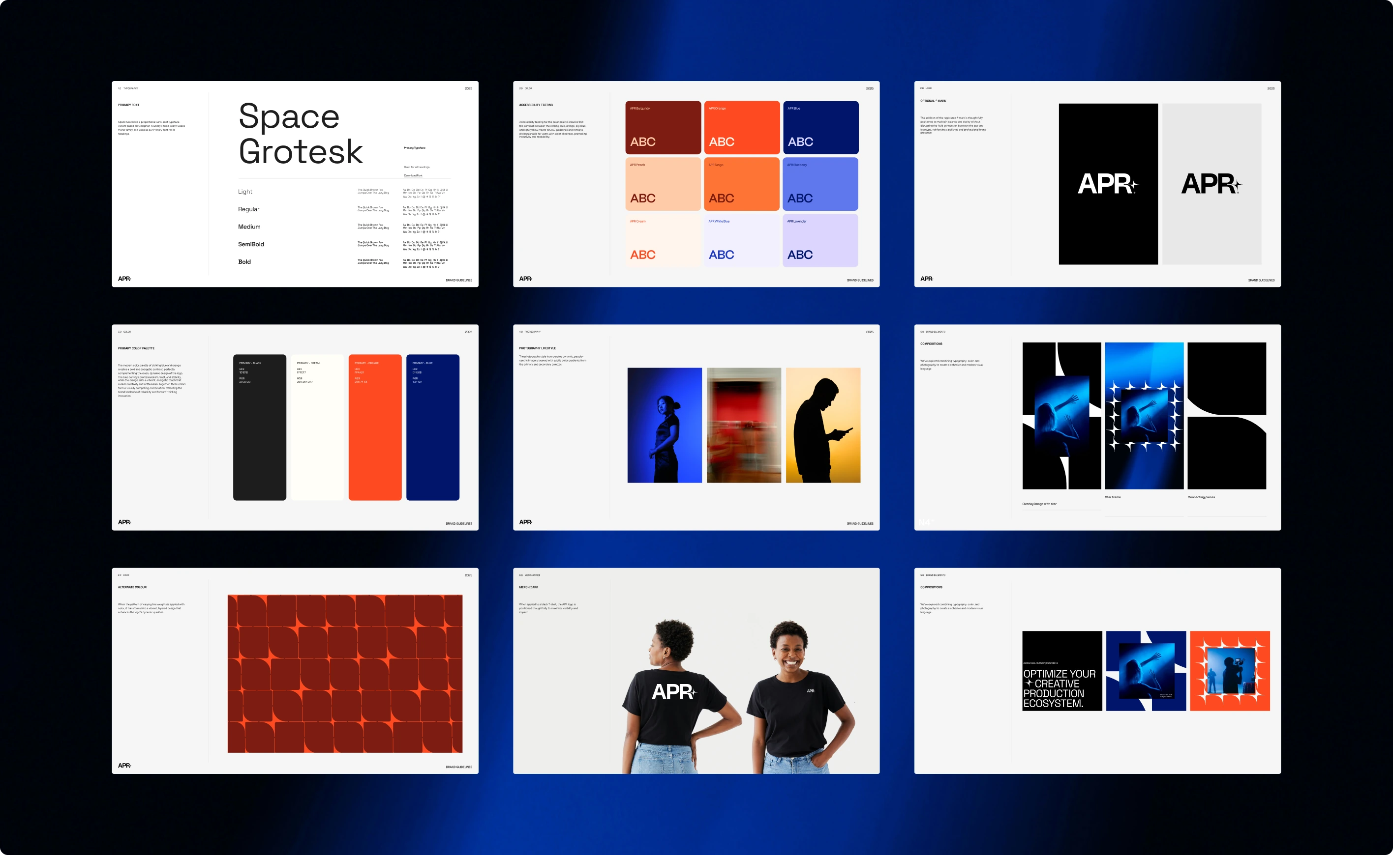
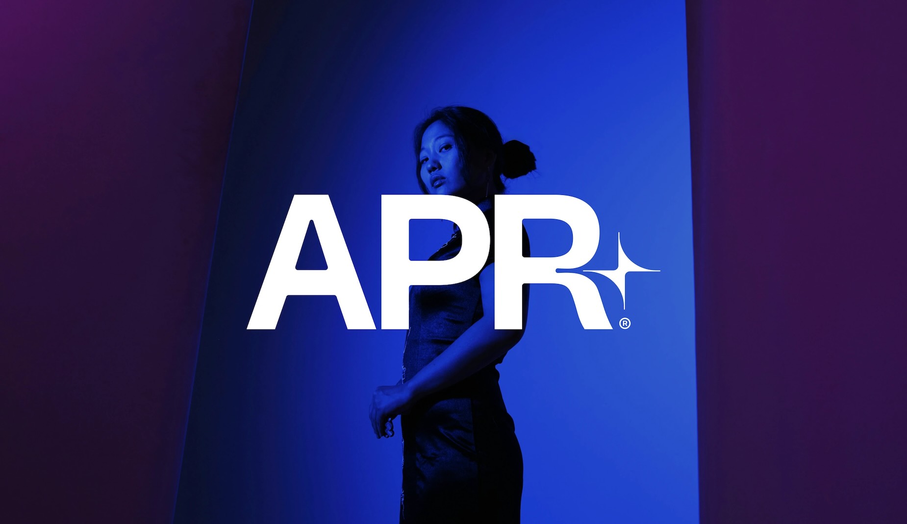
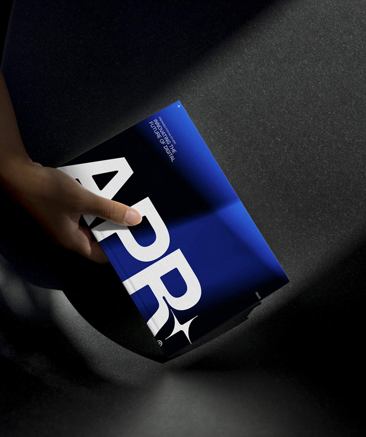
The identity grew from one idea. APR gives its clients a fixed point to steer by, so at the centre of the brand is a star, drawn from the North Star. It sits in the curve of a custom “R” in the logotype, then breaks down into a pattern of building line weights that runs through the wider system. Blue and orange lead the palette, backed by sky blue and light yellow. The type system scales to small screens without losing legibility, and the full palette was tested against WCAG contrast guidelines and for colour blindness.
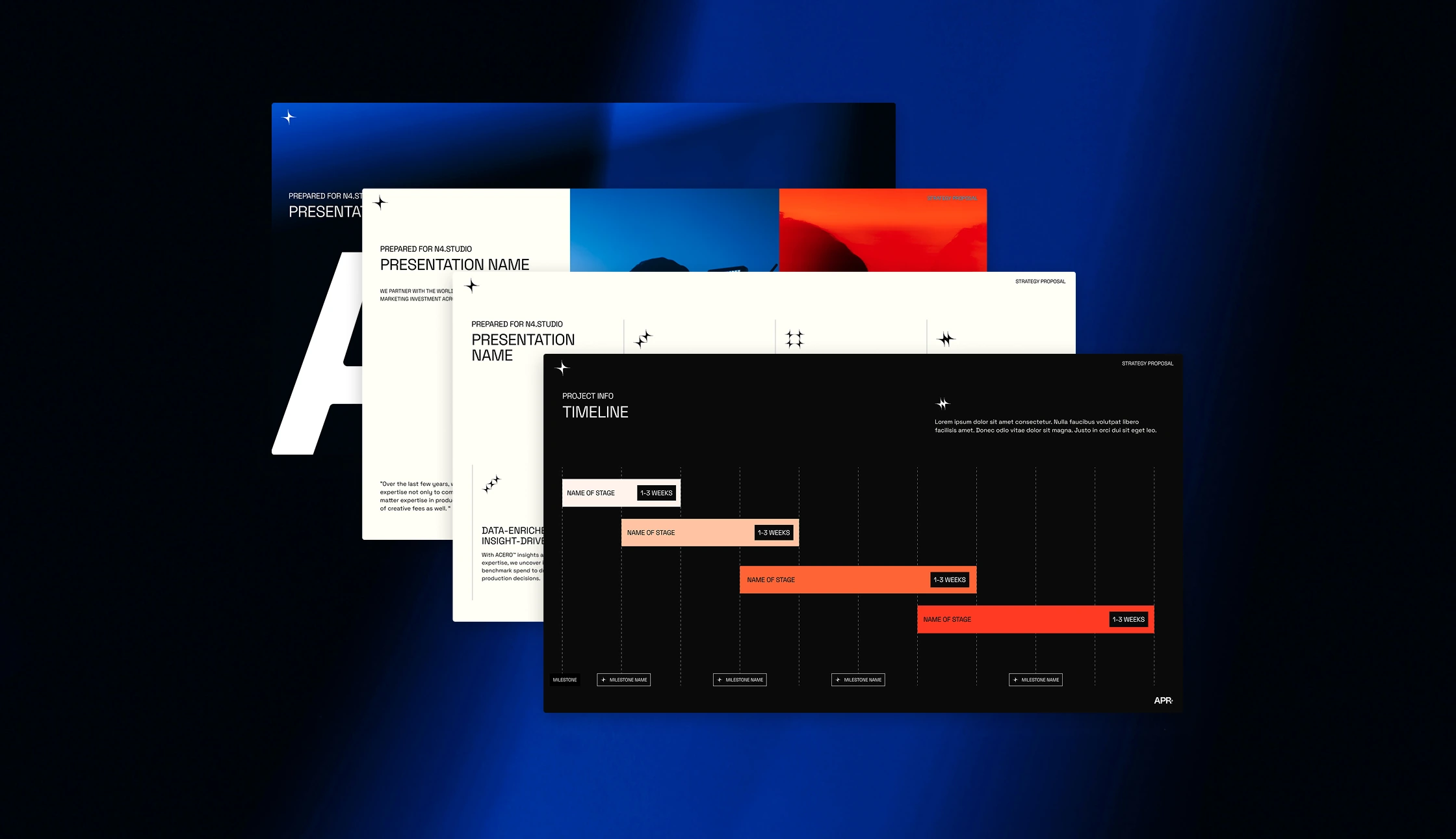
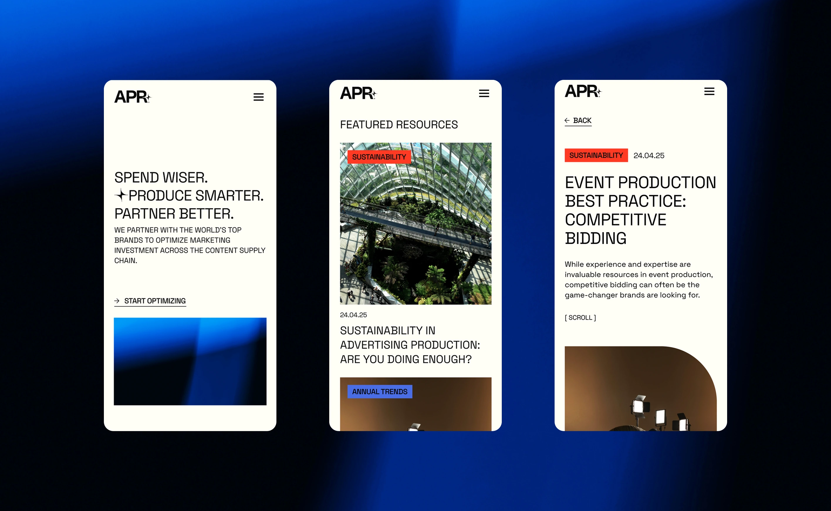
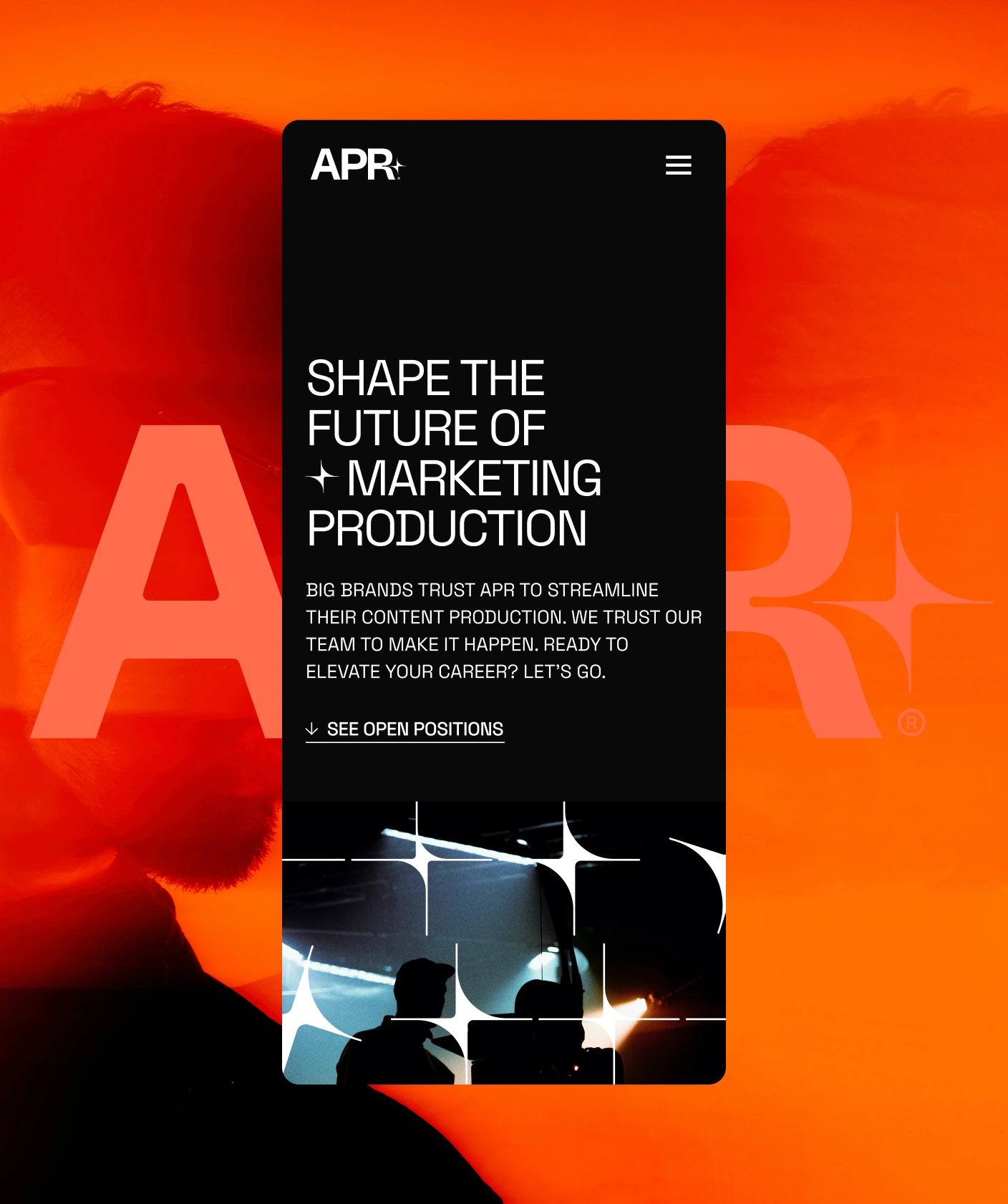
The system was built to work everywhere APR shows up: proposals, decks, reports, and the website, which we designed and built on Webflow with interactions and animation throughout. It scores 100 for accessibility on Google Lighthouse.
Accessible for all users
APR’s type system scales down for smaller screens without losing legibility, and the full palette was tested against WCAG contrast guidelines and for color blindness. The site scores a perfect 100 for accessibility on Google Lighthouse. Twenty-five years in, APR looks every bit the market leader it is.
More Projects


Fried Egg Golf
A digital clubhouse for golf obsessives


Business Insider
Business journalism doesn’t have to be boring


Olympia London
A digital transformation to match Olympia’s physical rebirth